Tuesday, October 21, 2014

Why?

So I finally got my hands on some Topps Update tonight.  I had been in a few blue parallel stores late last week - nothing.  I stopped in to a red bullseye store to pick up a couple of things tonight, and I grabbed a hanger box.

This was the first card showing in the cellophane.  And the Giants won tonight 7-1.  Take that for whatever you think it might mean.

But I happened to notice something.  I like looking at the backs of cards. 


Most of the card numbers look like this.  All smooshed in the corner to fit the US- before the number.  Although the Highlights card looks as though it has the swoosh shifted down a bit, allowing more room for the number to fit.

But.


Then I noticed all of these.  The US is above the number.  And there's no - between the US and the number.

I know I know.  My OCD is kicking in here.  As it turns out, these are all All-Star Game cards.  So it appears Topps made the numbers for those cards different from the rest of the set.

Why??

Oh yeah.  And there was this..


C'mon man!


Anyhooooo

You may have noticed one of the highlights of the box for me there.

Yeah, there's too many Trout cards already.  I don't care.  I'll take them all.  Let's see some other highlights of the box..


Slayer parallel!  Yep, still love themI can't get enough of these.  Love 'em.


Pink parallel (#/50) of Amarista.  I guess that's a hit.  Amarista was a guy the Angels traded away.  The guy played 105 games in 2012 and 146 games in 2013.  So I'll give you a bonus "why?".  Why was Amarista not in the 2013 base set?  Or even the 2014 base set? 

Wednesday, October 15, 2014

Settling in

So I got everything (almost everything) moved from the old place to my new house on Friday.  I had spent the better part of a week taking boxes over, so that my friends could just help me with the big stuff.

I have all my cards in a closet at the moment.  I'm still deciding on a plan for them.  But hopefully they will end up being more accessible than they were in the last place.  I had them under the bed, on shelves in a closet that wasn't easy to get into, all over the desk (of course), and on the floor.

The computer is all hooked up with internet (obviously) and the scanner is ready to go.

And just today I got my first package of cards addressed to the new house.  Feels like home now.

Robert from $30 a week hooked me up with a bunch of missing cards from 2014 Topps.  You've all seen them, so they're probably really only of interest to me.

But he also threw in a couple Angels for me.


I've said before that Topps has overdone the parallel thing.  But I've also said before that I'm a sucker for parallels.  So Mr. Downs is quite welcome here in the (new) land of Junk Wax.  Mark Harriger there never made it out of AA ball, and in fact his name isn't even hyper-linked over at The Trading Card Database.  Poor guy.  At least he has a page over at the BR bullpen.

But the star of the package is probably the 1997 Donruss Preferred - X-Ponential Power #6A Tim Salmon.  (Quite a mouthful huh?)  Its not only die-cut, but its clear too.  And it isn't teal.  I tried scanning it solo - still teal.  I tried scanning it sideways - still teal.  Its actually a shiny, refractory, metally looking card.   Its also card 6a.  6b is Jim Edmonds.  Why didn't they just make them cards 6 and 7?  That's the 90's I guess.

Thanks for thinking of me Robert!

Welp, time to go do some more unpacking.

Oh yeah.  Go ahead and vote in my little poll up at the top right.

Friday, October 3, 2014

Pause

It wouldn't exactly be out of character for this blog to only have sporadic (or no) posts over the next week or two.  So when I say that is exactly what will happen, nobody should be surprised.

What is different is the reason for said inactivity.

I bought a house.  Been saving and searching for a couple years and finally got one that works.  Just a couple blocks from the place I'm renting, so my girls can stay in their school.  So the collection is about 80% boxed up at the moment.  And the scanner is about to be packed.  I didin't get time off from work until late next week and the following week, so I'm just taking boxes over at the moment.  (If I'm in your address book, drop me a line if you want the new address)

I'll just pretend that the Angels didn't lose the Royals last night...

I had a great post idea to show old stadiums and the new stadiums teams moved into.  You know, as a parallel to me moving into a new house....   That never really came about.


But I'll leave you with something I found kinda funny.  Just bought a lot on eBay to supplement my 1982 Topps football set (I'm only 27 cards away from completion).

I saw two cards that I just had to pair together.

There's all kinds of lines running through my head... the Ram surrendering to the Lion, etc.

I guess the fact I found that interesting shows how my mind works....

Monday, September 22, 2014

Compare the Design, 80's edition

In my recent post about a football card repack I noted how Topps used the same design for their baseball and football sets in 2011.  That got me to thinking about a time before they used that practice.

A cursory look seems to show they only started that in 2010.  Maybe they did it at some point in the 90's, I don't know.

But I wanted to go back to when I started collecting cards.  So let's compare the designs that Topps used for their baseball and football sets back in the 1980's, shall we?

1980


Not really a whole lot of design elements going on here eh?  This was actually just before I did any kind of card collecting, so I have no particular sentimental attachment to either set.

Both sets have a particular color scheme for each team, but those colors don't necessarily have anything to do with the team's colors.  Topps still had no NFL team license, hence the airbrushed helmets (except the Rams which I could never figure out). The baseball set was at 726 cards, while the football was at 528.  I like the football All-Pro banner better than the baseball All-Star banner.

I think I'll have to pick the football design here.

1981


This was the first football card set I collected.  I would get my allowance from my dad, and promptly walk over to the Long's and buy a pack.  I bought some Fleer baseball in 1981, but didn't see much Topps.

I remember really liking the hat on the baseball design though.  Maybe it would have been better if there was a logo instead of writing, but I like it.  The football All Pro banner in black seemed to be jarring to me at the time, but it stood out.  I didn't happen to choose any football cards with helmets, but Topps was still air-brushing out the logos in 1981 (still except the Rams).  Notice the use of different logos.  Set sizes stayed the same.

Despite the sentimental aspect, I pick the baseball design here.

1982


In 1982 I collected these football the same way as 1981, maybe even more so.  But I collected my beloved Fleer baseball, not Topps.

This is probably one of my least favorite Topps baseball designs.  Drab.  Washed out.  Ugh.  On the other hand, this is maybe my favorite Topps football design.  The got the NFL license, and the put the logos right out there front and center.  The baseball design got rid of the All-Star banners in favor of a subset.  Note the logos are the same.  So Topps changed their logo sometime in summer of 1981?  The baseball set enlarged to its familiar 792 cards.  Football stayed at 528.  The football set also started grouping the cards by team.  AFC in the first half, NFC in the second half.

In a landslide decision, I pick the football design.

1983


I didn't really collect as much in 1983.  I got a pack or two of Topps baseball, but mostly Donruss.  I only got a handful of football packs.

Topps really stepped it up in baseball after the boring design of last year.  1983 is a classic (to me at least) baseball card design.  The football design is a step back though.  Very basic.  Very basic.  And yet I really liked it at the time.  Sentimental I guess, "absence makes the heart grow fonder" type thing?  Baseball held at 792 cards, while football dropped to 396 cards.  The All Pro banner was replaced by a Pro Bowl banner.  No banner for baseball.

I have to pick baseball here.

1984


I got a handful of baseball packs in 1984, but it was a lower volume year overall than in 1983.  But Topps was my major brand for the first time.  The football cards I was buying with my lunch money at the local university over the summer.

Another classic design on the baseball card.  I've said it before, but I think I'm one of the few who actually like 1984 more than 1983.  Topps was continuing its use of a random color scheme for each team on both baseball and football.  The offset angle of the football card cuts down on the usable area for a picture, but its a decent enough design. Sets sizes held steady at 792 and 396, which they would for the rest of the decade.

I gotta pick baseball here.

1985


I got some 1985 baseball, but somehow ended up with a box of Fleer that year.  I only got a couple of packs of football.

The baseball design seemed like a letdown after the previous year.  I don't think I was really aware of 1971 Topps baseball, so the football design seemed really exotic to me.  Borders that aren't white?  And it was all horizontal.  The Pro Bowl banner was replaced by a tiny yellow All Pro designation at the top left.  Both sets were better color-coordinated to the team.  Although the Angels seemed to end up with yellow alot.

Neither one is a favorite for me.  Neither one is particularly bad either though.  Push.

1986


I collected boxes and boxes of 1986 Topps baseball.  I might have eventually had two complete sets at one point.  I also had more football than I had since 1982.  I never really collected Topps football after 1986 either.

This might be blasphemous to some, but I don't really like the baseball design.  The football design has some good and some bad.  The green border was new to me, but the white lines are odd.  I later learned that if you put them all together in a grid in the right order, the lines would all match up.  The weird color coding is back on the football design.  Purple for the Dolphins?  Topps started ordering the players within each team differently.  From 1982-1985 they were alphabetical.  In 1986 the team was grouped by position, QB first, then RBs, Receivers, OL, DL, LBs, and DBs.  The teams were also ordered by record, further Fleerifying the set.

I pick football by default.

1987


I also bought boxes of 1987 baseball.  I also bought a fair number of Donruss.  I bought maybe 2 or 3 packs of football.

The baseball set has a classic design.  I was only vaguely aware of 1962, so I didn't put the connection together at the time.  The football design seems last minute.  "Hey throw a couple of banners up top"  The All Pro designation is tiny, probably an afterthought.  But at least its still there.

Baseball is the choice here.

1988


I bought a bunch of 1988 baseball, but I never did complete the set.  If I own any of the football cards, they came in repacks.

That banner on the baseball design looks familiar.  Topps tested it out on 1986 football.  Another last minute looking design on the football card.  "angle the bottom off the photo, and drop a helmet on it".  And yet, both designs are just so-so.  There's potential for both, but they just miss.

I'll pick football for the helmet in the design.  That always gets me.

1989


I bought a bunch of 1989 baseball, and ended up with way more somehow later on.  I may have gotten a pack or two of football.

The baseball design is really good actually, but I've been inundated with it and need to get rid of thousands of them.  I think Topps is mailing it in with the football designs.  They had no competition yet, much like baseball a decade earlier.  So the 1987-1989 football designs are really analogous to the 1978-1980 baseball designs.

I gotta choose baseball, since there really isn't a design on the football cards.

So baseball wins 5-4, with one tie.


Saturday, September 20, 2014

Random non-sport quick post

I recently saw a couple of cards on another blog (I wish I could remember where), and I was instantly fascinated. (edit: Found the post I saw)

So off to eBay I went.

And I won (overpaid maybe?) a lot of 7 cards:


1956 Topps Flags of the World cards.  These are awesome.  Spain is a bit beat up there, but that's okay, I'll live.  Near 60 year old cards?  With flags?  What could be better?


SOME - BRARE- OH.  That's funny to see it spelled out phonetically.

If anybody has a particular connection to the country of Honduras, I have an extra.


Friday, September 19, 2014

The Good, the Bad, and the Ugly

Had the pack busting itch the other day.

I haven't finished my Topps base set this year, but I'm at the point of diminishing returns, so I didn't feel like getting 90% dupes.  I can't justify the price of Chrome, just not enough bang for my buck.  So even though I wanted some Chrome, didn't buy that either.

Just as i was about to leave the card aisle empty handed, I spotted

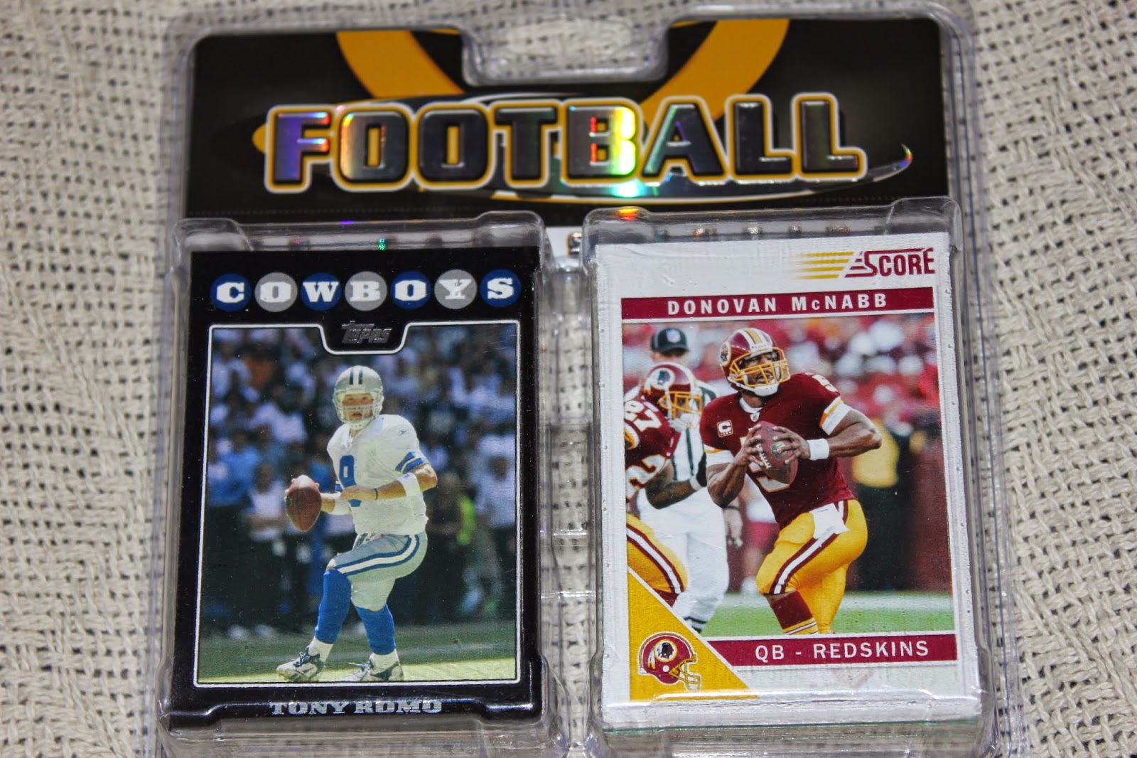
this hanging there.  Its got a Cowboy right there on the front.  (I'll ignore that nasty card to the left for now.)  I do recognize that picture, so there was a little hesitation.  But I went ahead and popped on it.  $4 for 100 cards.  Why not?

Turns out I have a white bordered version of the Romo card, so I'm good.

I didn't realize until I got home

There's a dreaded Redskin on the back too!  Uh oh.

Let's see what's inside:

The Good


Three Cowboys.  With 32 teams, I guess that's right what I should get.  (edit: I checked.  There's no Raiders, Patriots, Titans, or Bills in the repack.  But 5 Bears)   I'd have taken more.  I'm pretty sure I have that Everson Walls, as I bought a fair number of 1989 Pro Set.  I hadn't really been in football cards for a few years, but I spent a year or two buying football cards at the beginning of college.  Shepard wasn't a Cowboy long, but I'll take any Cowboys I can get.

The Bad
I would normally show you all the Redskins here, maybe throw in the 49ers, Eagles and Giants too.  However, in light of recent events, the bad in this repack is apparently

Yup, I got two of them.  Back to back.  Maybe they're trying to dump all of their Muhammad Ali Ray Rice cards.

The Ugly

Redskins could go here too...

Ugly designs.

Some of the Rest

 This could be in the ugly pile too.  8 different card products from 1991 alone in the repack.  This doesn't even have Topps base.  I had gotten out again by this time.  And I'm kinda glad I did.


I wasn't back into collecting yet in 2011, but I've liked this design on the baseball side.  And while I think its rather weak to use the same design for both sports, I think the design works real well on the football side too.

Then again, I kinda like the competition design too.  It kinda has an early 90's feel to it or I might like it even more.

I really don't have any desire to collect football cards other than maybe trying to complete some sets like 1982 and 1983, or start getting some vintage (I have a complete 1981 set).

On the other hand, I can't seem to get enough Cowboys cards.  If anybody collects a particular team, I have a couple of other repacks so let me know.

Tuesday, September 16, 2014

M.I.P.

The last two years in a row, the most valuable player in the American League has finished second in the MVP voting.

If there's any justice,

Mike Trout will finally win his MVP this year.  The Angels have now clinched a playoff spot, and their magic number for clinching the division is just three with twelve games left to play.

But if we're being honest, Mike Trout is not the most important player in the A.L. West race.

The most important player in the A.L. West doesn't even play in the A.L. West.

On the morning of July 31, 2014, the Oakland A's were 66-41 and 2 games ahead in the division.

Since then, the A's are 17-25, and that includes winning the last two in a row.

On July 31, the A's traded

Yoenis Cespedes away, and promptly lost 25 of their next 40 games.

You can say it was a coincidence.  I say Billy Beane underestimated the importance of Cespedes to that lineup.